A trip to Berlin has inspired a German twist to this week's posts. Today we highlight the design joy that is Berlin's Jewish Museum while Wednesday shifts the focus to Ostalgie, the bizarre nostalgia for the good old ways and styles of the GDR. On Friday we look at some interesting developments in German architecture and, this might not be one for the wine snobs out there, recommend a decent German wine to take you into the weekend with a smile – Prost!
Jewish Museum, Berlin
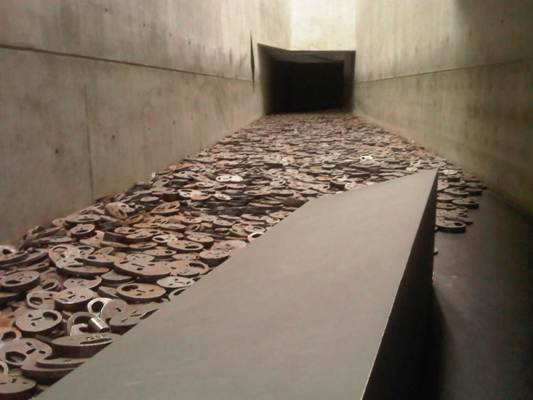
Berlin itself is beautiful and laid back like an unhurried New York – or perhaps New York's a speeded up Berlin. But it wasn't until we encountered the glory that is the Jewish Museum that the city's aesthetic kicked in in full force. Elegant and meaningful, the architecture of the museum is an intrinsic part of the narrative and a triumph of worthwhile creative thinking.
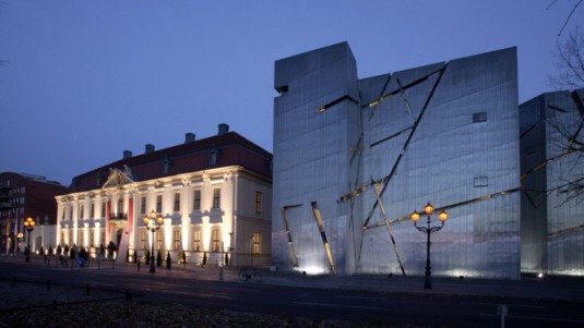
The museum's aim is to present 2000 years of Jewish history in Germany rather than 'merely' the horrors of the Nazi era and covers everything from Roman times to the community's current renaissance in – at times – painstaking detail. But what stuns is the building itself. Polish born architect Daniel Libeskind – whose credo is 'architecture is language' – has attempted a 3D realistion of Jewish suffering.
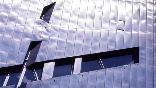
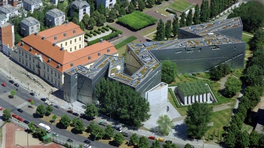
The museum's zig zag outline is a broken Star of David and has the potential to become a symbol of Jewishness in itself – what an achievement for an architect that would be. The zinc walls are harshly angled with only small gashes in its sides in place of windows. Inside, three ascending walkways suggest three outcomes: holocaust, exile or continuity. Everything is beautifully finished and a pleasure to move around. It is not the fault of the museum's design that you leave utterly drained.

The building is absolutely astonishing and your commentary very moving. Makes me want to go and see it.
Thanks Alannah. And do go if you get the chance – it’s quite an experience