In the third of our regular features on Dunfermline architecture, Sam Foster introduces us to the concept of ‘loose fit, long life’ buildings. It seems we have plenty of them locally and the recently refurbished Fire Station is a prime example…
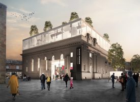
‘I’m guessing you’ll have already have been to Fire Station Creative – the refurbished Dunfermline fire station on Carnegie Drive – because when I went up there for lunch at the end of last week it was packed. It seems that within just a couple of months of opening everyone knows about it. And quite right too because it’s fantastic, but who’d have thought of putting an art gallery and studios into an old fire station?
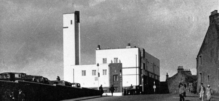
Let’s go back eighty years to 1934. Built for the ‘Corporation of Dunfermline’ Dunfermline Central Fire Station, as it was officially called, had just been built to designs by the prolific Dunfermline architect James Shearer, who used the very fashionable ‘International Style’ as the basis for its external design. Typified by steel and concrete construction, white render, dark brick detailing, slim metal-framed windows and flat roofs, the building would have been (and still is) very different to the surrounding stone walls, pitched slate roofs and neo-Victorian style that folk were used to. (Architect George Duffus took much inspiration from this when he designed the very similar Kirkcaldy Fire Station in 1938.)
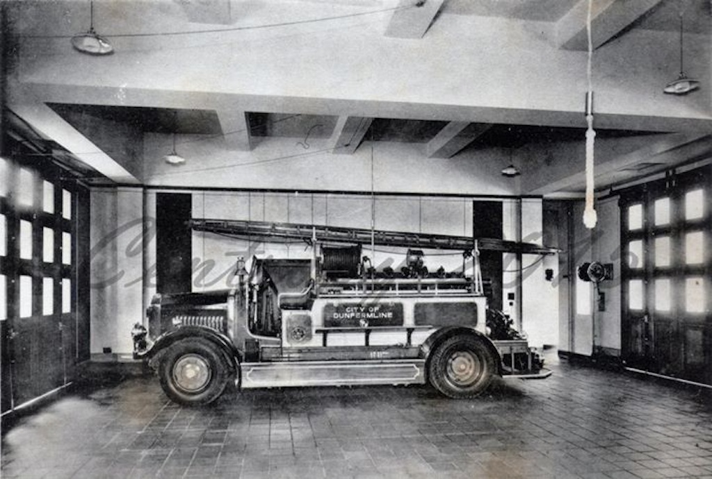
And for seven decades the building worked brilliantly as a fire station, with the gleaming fire engines sitting poised for action behind the big garage doors, and firemen upstairs in their bedrooms and social rooms waiting for the call to action.
But times and priorities change; economic pressures force the increasingly centralised fire service to abandon the building and it sits empty for a while. Who needs what is basically a big room downstairs with wee rooms upstairs? But therein lies its salvation.
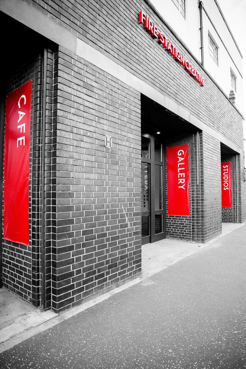
In the background Fire Station Creative had been born; it’s aim to create a gallery space and café downstairs and provide studios and classrooms upstairs. It works brilliantly, and the refurbishment hasn’t taken away the character of the building either. The popularity of the café, full occupation of the studios (with waiting list) and 18-month programme for exhibitions show how well it has worked.
(photograph: Steve Adam)
But what makes it work?
Luck? Nope.
Decent coffee? It helps but it isn’t the key.
Graft? Definitely. Ian, Sarah and John (the folk behind Fire Station Creative) have worked their behookies off to get this up and running successfully.
A good idea? Absolutely. And good management to make sure the idea develops over time to suit the changing needs of folk.
The building? Without a doubt. The building, which is huge, was refurbished for less than the cost of buying a semi-D in Duloch. That must have made the grant funders happy. Ultimately what made it so straightforward was the simple structure and layout.
As architects we call this ‘loose fit, long life’. Basically the simpler the building can be the more uses it will be put to. Think of old mill buildings, for example: these get turned into apartments, offices, storage warehouses, artists’ studios, workshops, shops and a dozen other things. Look around Dunfermline and you’ll see not only refurbished mill buildings (beside wee Asda at St. Leonard’s, for example) but the Alhambra (which has been a theatre, cinema, dance hall, bingo hall and then theatre again) and plenty of Victorian houses being used as offices, museums, pubs and nurseries. The office we work in at the top of the New Row used to be a linen store. It also houses a deli, café, wine shop, dentist, other offices and music studio.
Further afield Edinburgh’s Georgian New Town buildings continually evolve through a cycle of houses, offices, shops and flats, with each generation doing a bit of maintenance and improvement. Close to Bradford, the enormous mill buildings built at Saltaire by Titus Salt have become art galleries, restaurants and design shops. Derelict wharf buildings in Manchester, Liverpool and London house apartments, cafes, boutique shops and hotels. Banks become bars.
What they have all tend to have in common is high ceilings and a feeling of airiness, decent-sized windows to provide lots of daylight, robust walls, floors and roofs that can be easily knocked about and repaired, and the ability to make larger or smaller space as needed by the occupants – e.g. by taking down or putting up walls.
They all seem to have been built before about 1945 too. After the end of the Second World War there was a massive rush to re-build the country and a corresponding boom in the development of building technologies such as heating and ventilation systems, as well as cheap and quick construction methods.
We’re still in this era and the result is highly specialised office buildings, hospitals, commercial sheds (think of the retail park at Halbeath), schools. All of these are designed with a single, highly tailored function in mind and tend to be placed on cheaper land on the periphery of settlements, leaving town centres and city centres with less interest – less reason for being. They tend to be mean in spirit as well as function and typically have low ceilings, small windows, long corridors, unused roof spaces and no soul.
The minds of developers and local Government are fickle things liable to change without notice, rendering obsolete relatively new buildings as old fashioned and out of date. Because they are quite bland and cannot be easily refurbished or sold to a developer for use as something else these newer buildings tend to be torn down. Look at the industrial estates around the town and you’ll see this in action.
In the meantime the older, looser-fitting buildings like the Fire Station adopt another use and keep on giving. Just think what could be achieved with some of the other loose fit buildings around the town…’
Sam Foster
20.09.15


