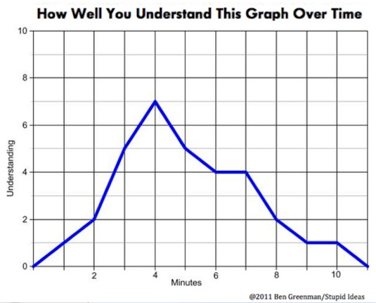
One of the many revelations of the internet has been the fact that Americans are better at nerdy humour than the Brits. Curated by Jason Oberholttzer, I Love Charts is a collection of graphs, pies and diagrams which at first glance look perfectly respectable and possibly even informative. Closer inspections shows that they are nothing of the sort. They are funny though.
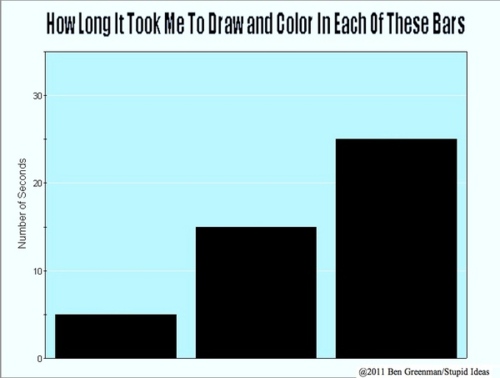
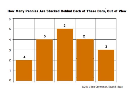
Ben Greenman, who devised most of the charts shown here, describes his inspiration thus: 'When I was a kid infographics were intoxicating because they promised a world of order and it's this promise that has come, over time, to seem like a cruel deception. Nothing that passes for a fact ever really is one. I am drawn to charts that obfuscate, or thwart, or somehow sharpen our sense of the absurdity of trying to accurately analyze information.'
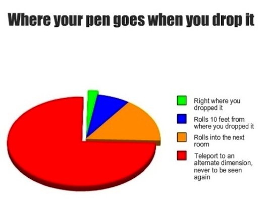
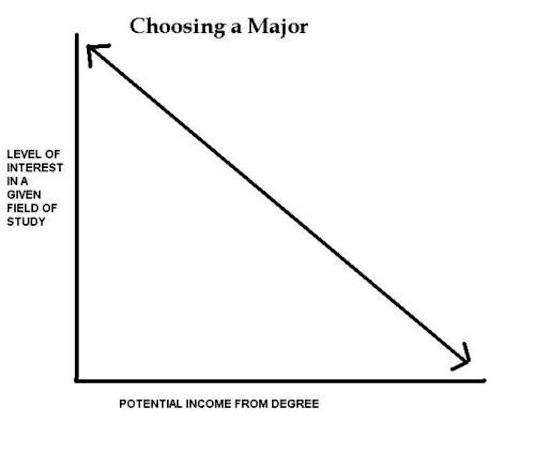
The site also welcomes submissions from readers, like this brilliant one below.
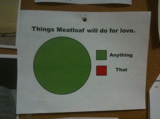


No comments!
There are no comments yet, but you can be first to comment this article.